Dashboard – Experience
Introduction to the Experience Score
The Experience Score is a comprehensive metric designed to provide insight into how well technology supports end-users in their daily work. By combining technical performance data with user perception, the Experience Score helps IT teams understand both the objective health of devices and applications and the subjective experience of employees.
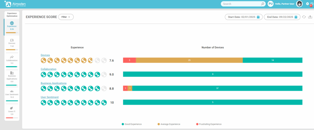
The Experience Score is divided into four key categories:
- Devices – Evaluates the performance, hardware capacity, compliance, and stability of each device. Metrics include CPU and memory usage, disk performance, device age, Windows startup times, and error logs. This category helps identify devices that may be slowing down productivity or causing frustration.
- Collaboration – Focuses on communication and teamwork tools, particularly Microsoft Teams. Metrics include audio and video quality, screen sharing performance (VBSS), call quality, and overall collaboration experience. High scores indicate seamless interactions, while low scores reveal potential issues impacting meetings and teamwork.
- Business Applications – Measures the efficiency and reliability of key business applications. Performance is assessed through CPU and physical memory usage, while application errors and crashes are monitored. This ensures that critical software supports productivity without resource bottlenecks.
- User Sentiment – Captures the human perspective on technology usage. Surveys and feedback provide insight into satisfaction, usability, and perceived productivity. This category complements technical metrics, helping IT understand gaps between objective performance and user experience.
Note: To understand how the experience calculation works, access the document
The Experience Panel provides a high-level view of user satisfaction.
Displaying quantitative charts about:
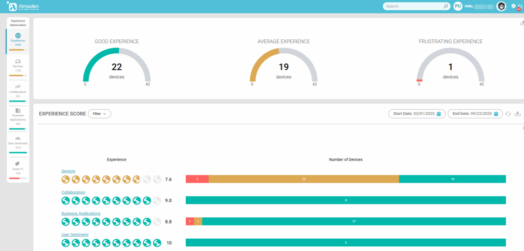
By combining these four categories, the Experience Score offers a holistic view of the digital environment, enabling proactive optimization, better decision-making, and improved employee satisfaction.
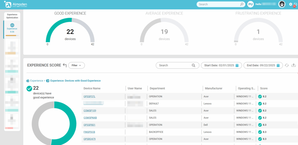
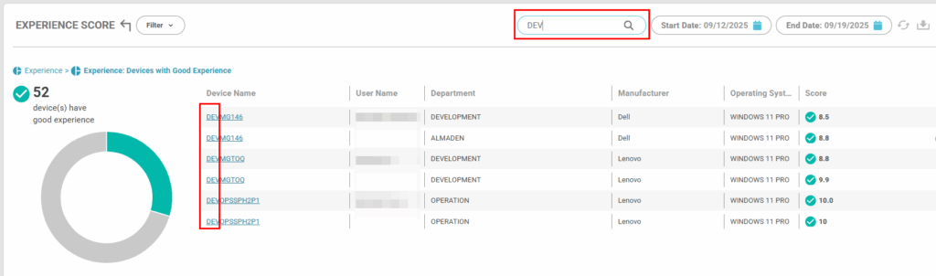
When clicking on the “Good Experience” graph, the classified devices will be displayed, this applies to the others (Average Experience and Frustrating Experience)
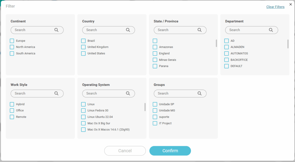
Filter, search and period
Options for filtering devices and periods

1 – Filter
- “Continent, Country, State/Province” filters depend on the devices’ geolocation data
- Departments are collected from CIQ ITAM settings
- The working style is defined in the administrative settings “CIQ DEX> Administrative Settings> Emplooyes“
- Groups are defined in administrative settings – Administrative Settings> Groups
2 – Search
Search by name or wildcard.
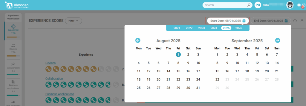
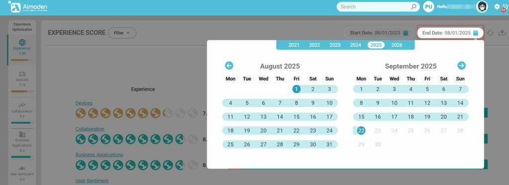
3 – Set period
Start date
Set the start date of your analysis
End date
Set the end date for your analysis.
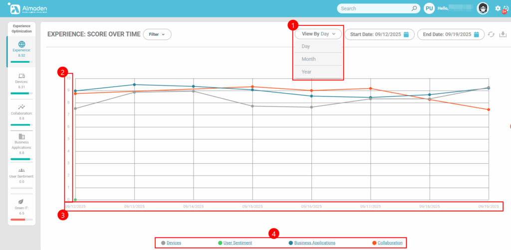
Experience – Score Over time
1 – Select the graphical view by: Day, month or year
2 – The column refers to the Score in the period, from 0 to 10
3 – Score date
4 – Score Type: Device, User Sentiment, Business Applications and Collaboration
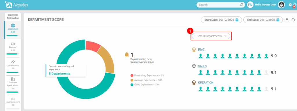
Department Score
Sort department score view:
Best 3 Departments or Worst 3 Departments
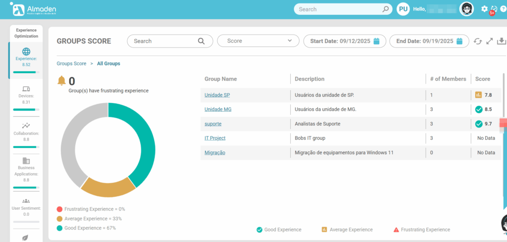
Group Score
Sort group score view:
1. Best 5 Groups or
2. Worst 5 Groups
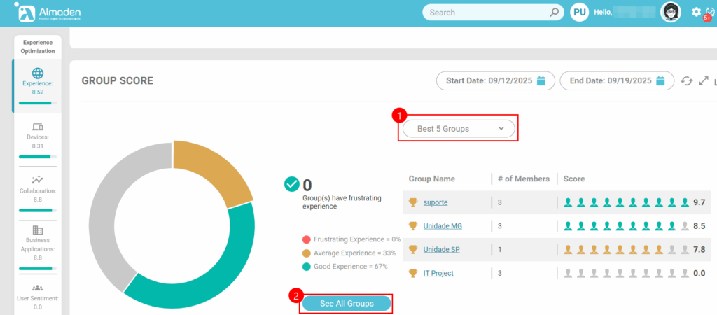
See All Groups
Displays the score view of all groups when there are more than 5